


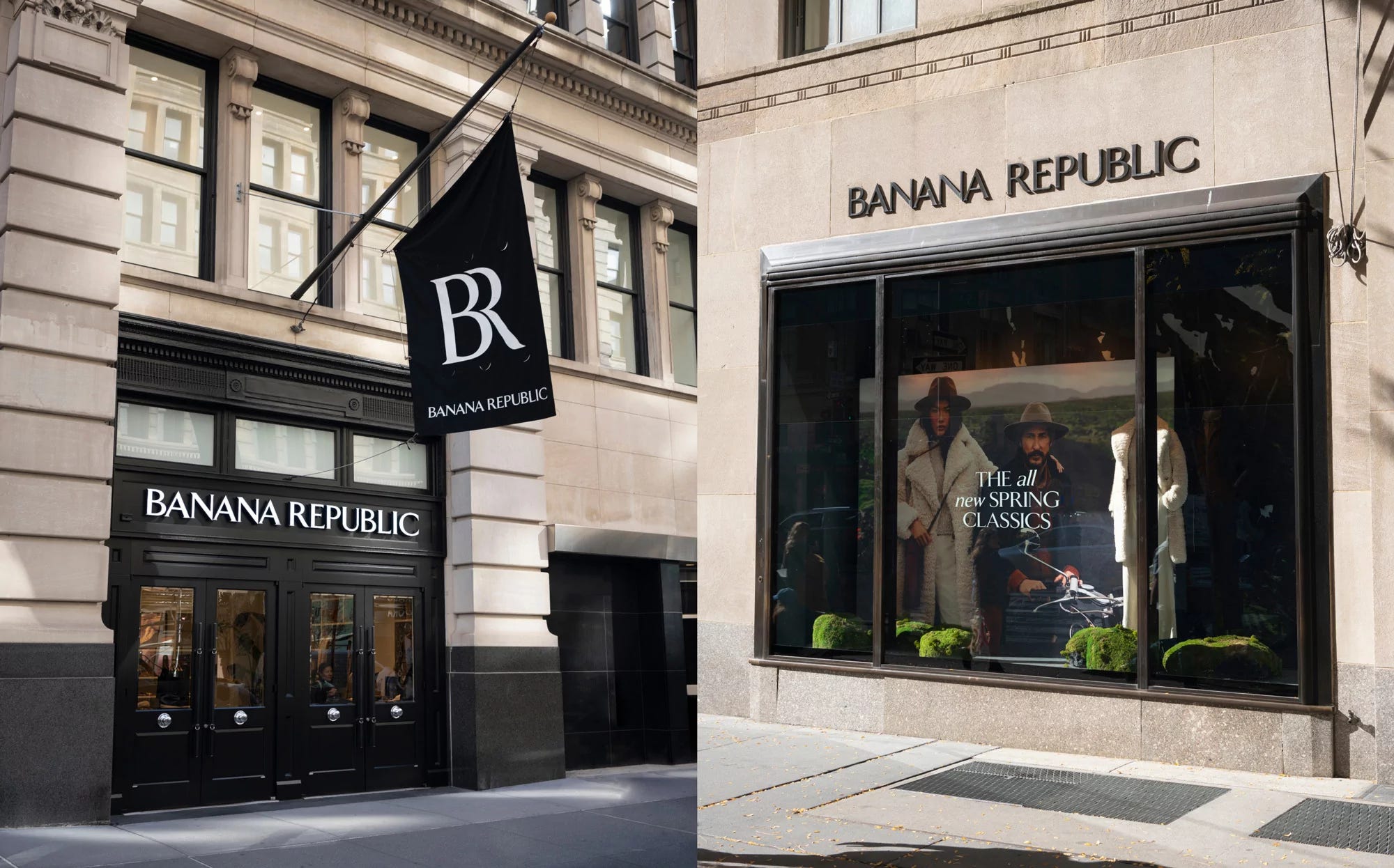
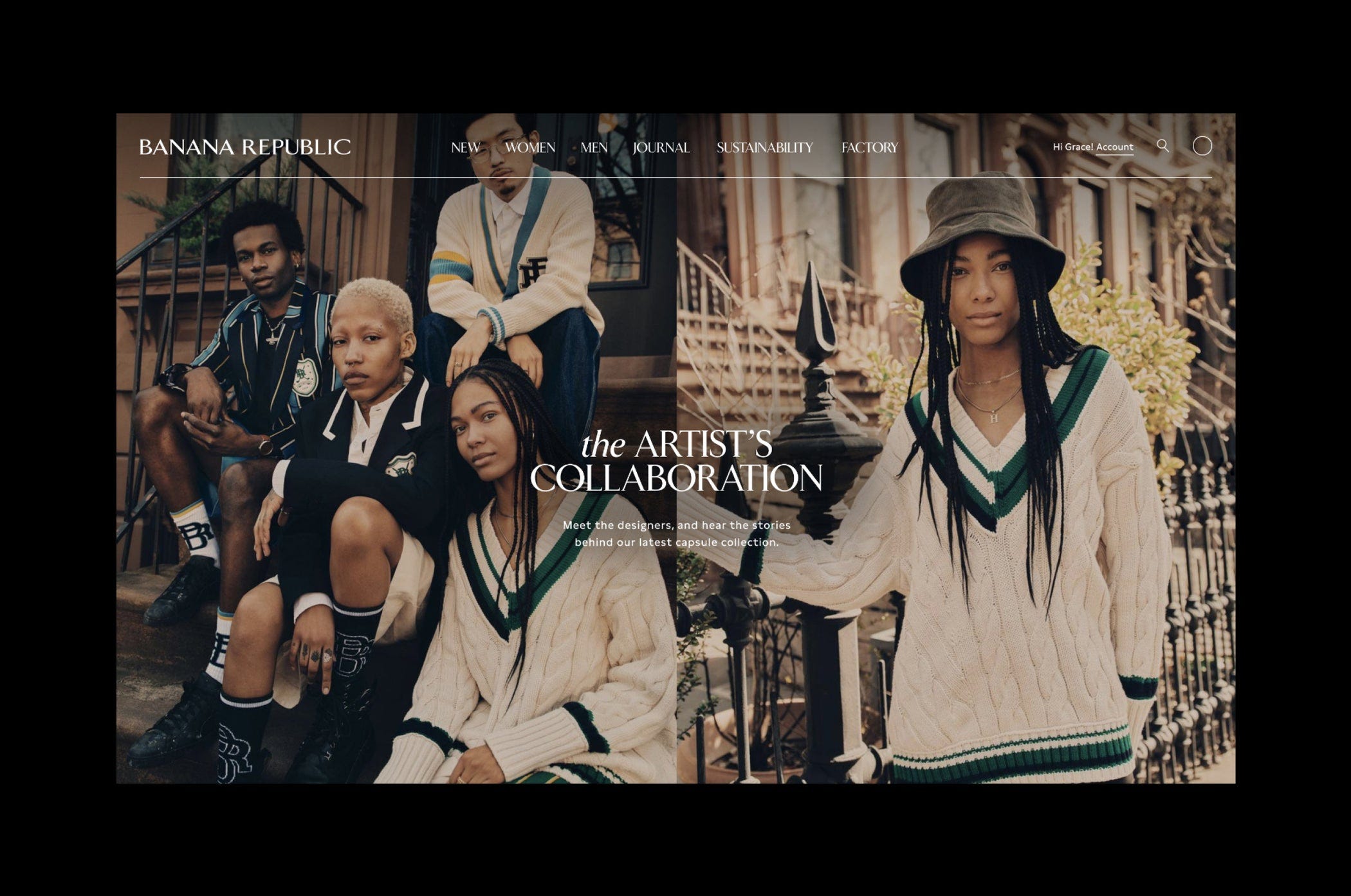
Banana Republic, the high street fashion brand beloved and mocked by Americans since the 1980s, has been refreshed by New York Studio Decade. Drawing from the original logo's shapes, Decade created a multi-logo approach to the design system—a thoughtful idea that plays to customers' memory structures and builds a system that fits the brand's ever-shifting tones.
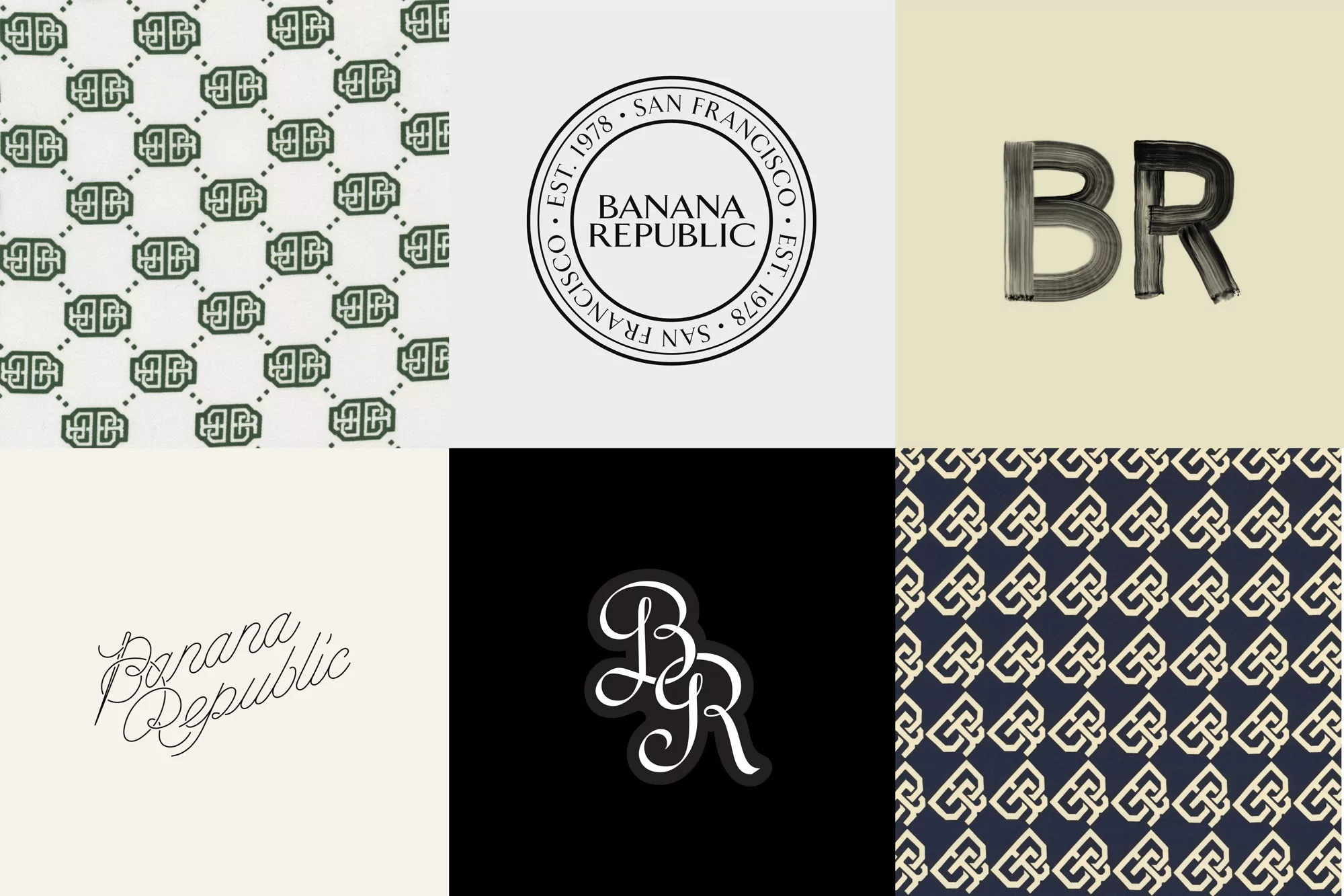
Working with type foundry Colophon, the team developed a custom serif typeface (potentially an emerging trend?). Multiple secondary logos, support typefaces, and monograms were also created, providing a tasteful and straightforward way to apply brand assets to products.
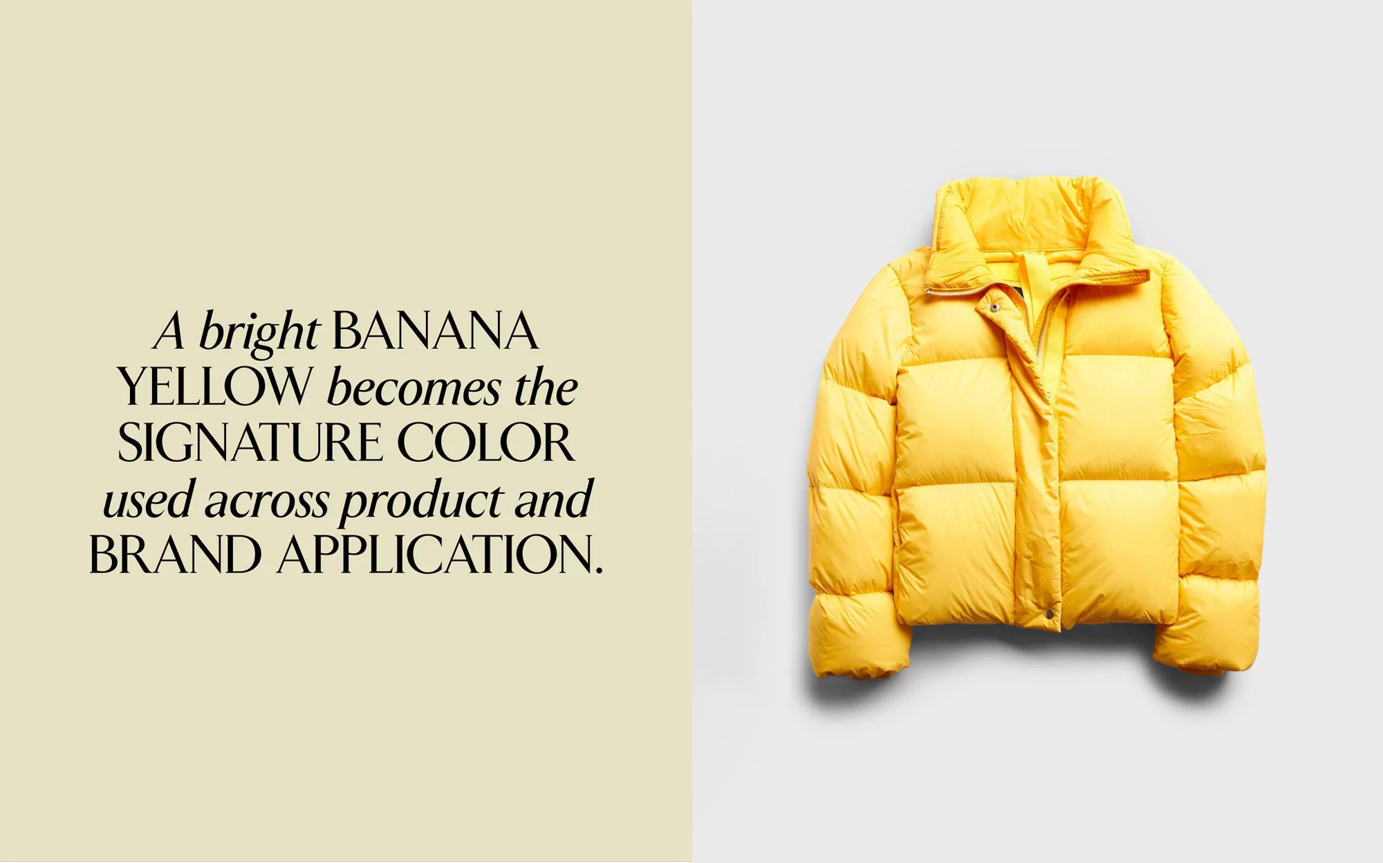
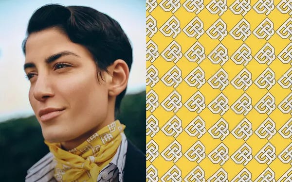
The signature yellow is present yet not overdone, powerful enough to be memorable without being too much.
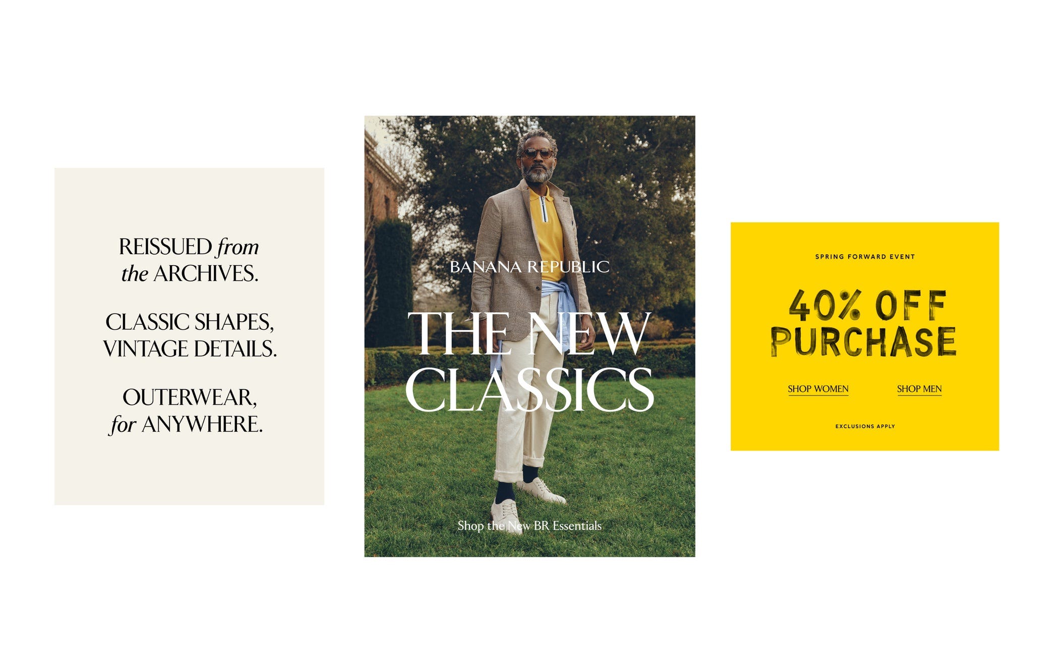
It has been a cohesive approach to the brand’s refresh, the rollout undertaken by Banana Republic’s teams across digital, marketing assets, store signage, clothing tags, and labels, and packaging. Art direction has taken a striking step up with others suggesting it has elevated the brand successfully amongst peers like Loro Piana [source]. Editorialised imagery now runs across all of the brand’s touchpoints moving away from the catalogue white backgrounds they used to run with.
Altogether, a thoughtful refresh of the brand—looking to the past to move forward.