


A pink tequila
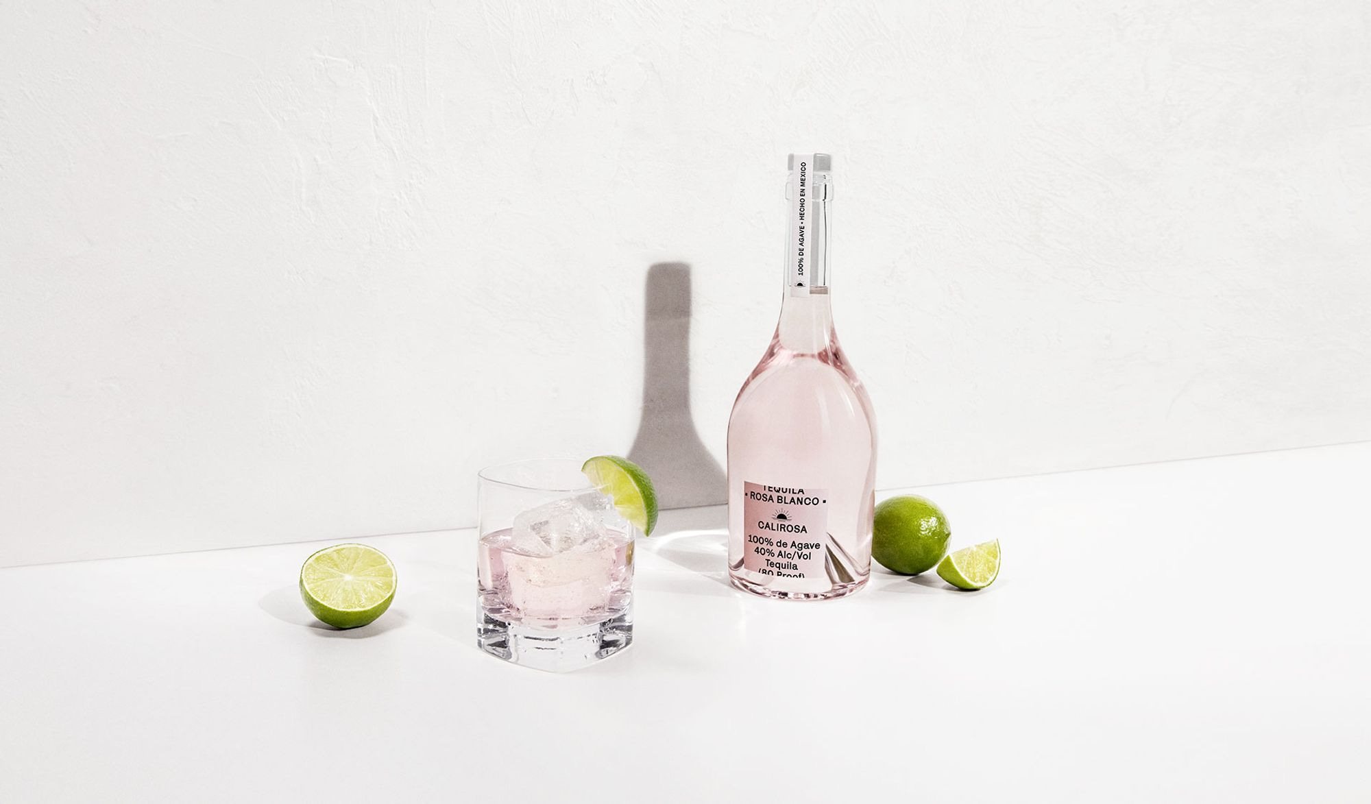
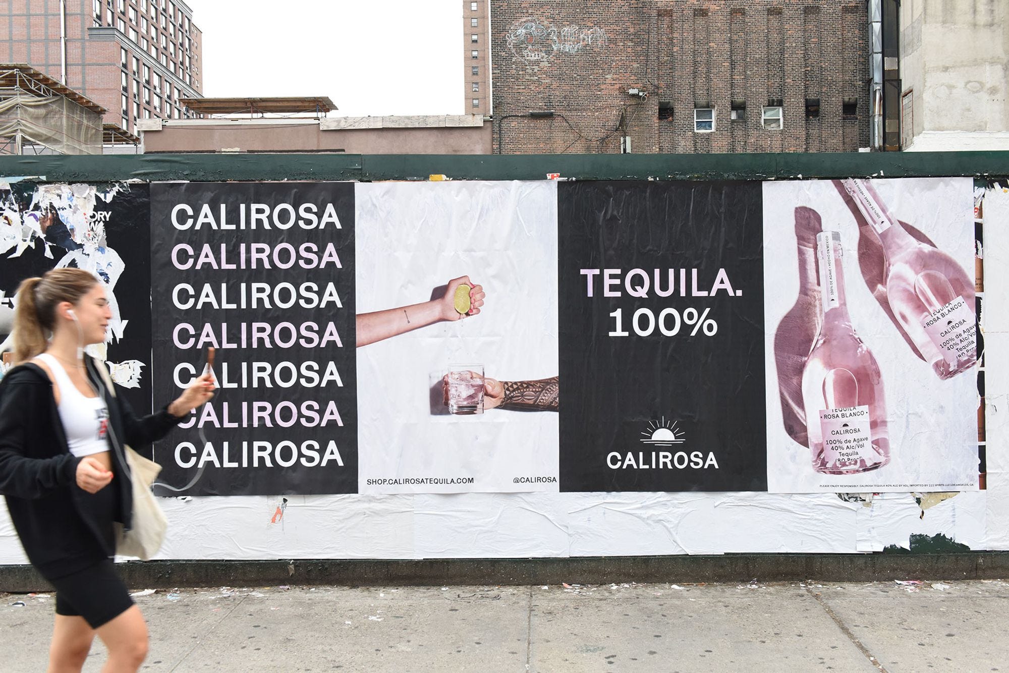
Calirosa's signature product, Tequila Rosa Blanco, stands out in an increasingly saturated tequila market with its “barrel aged” pink colour. To tell a modern story around a traditional spirit, Calirosa partnered with NY-based team Kingsland to concept and execute a product-focused campaign. This campaign educates consumers on a new product while staying true to the vibrant and rebellious nature of the brand's overarching narrative.
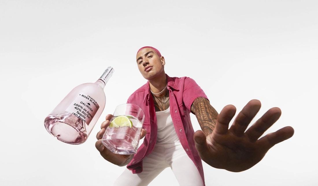
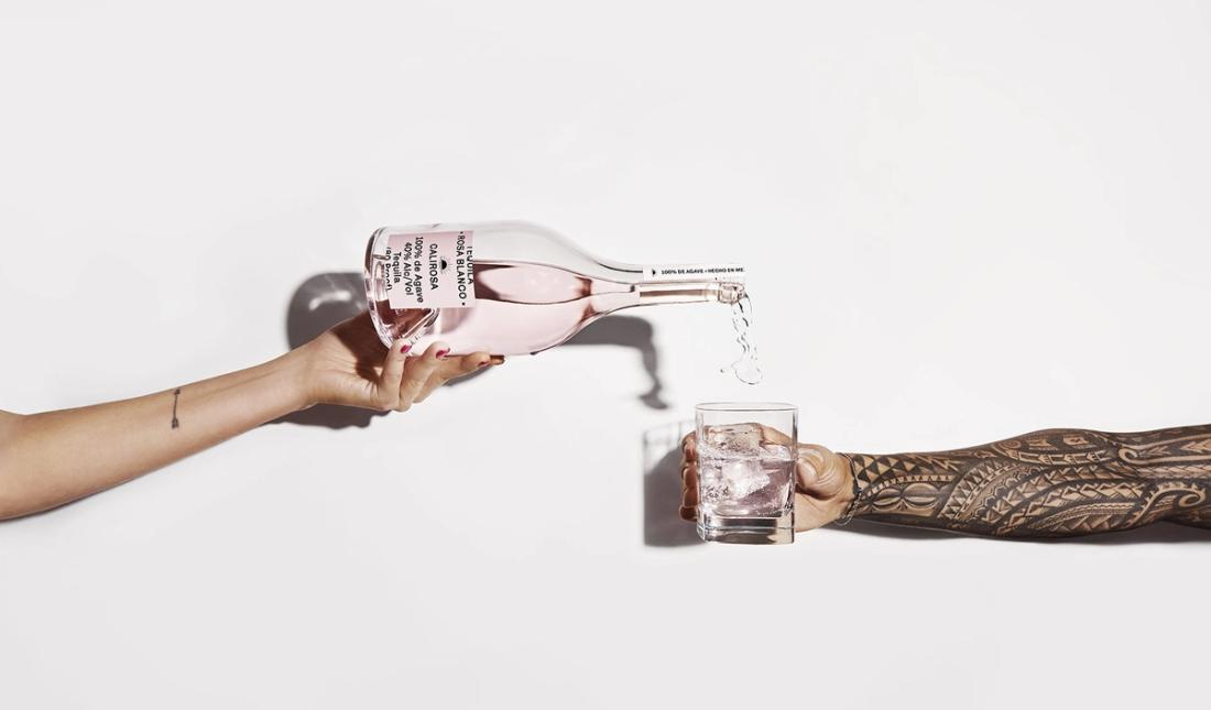
It's a fun and simple campaign of work that leans heavily into the distinct pink color of the tequila. The design of the pack allows the campaign to stay very singular in its focus, minimal in its approach, but with enough room to add lots of attitude and energy that is aimed very squarely at its audience [bit more here]. Throw in some very well-styled talent and you have a tight little campaign for a product that is looking to make some noise in a very busy market.
A boxed “liquid”
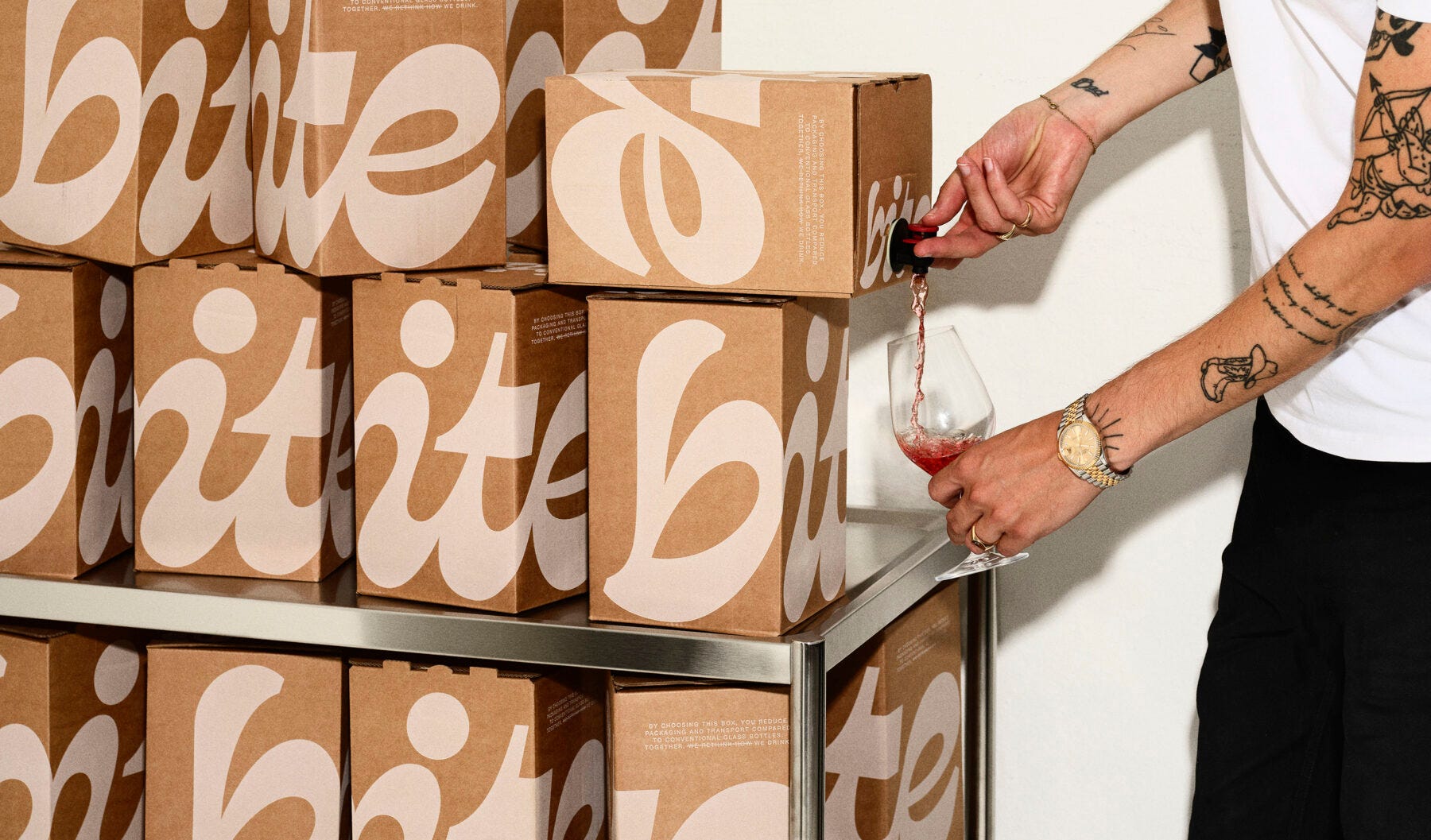
Danish studio Everland have refreshed a cafe syrups business, The Syrup Co., which had been making syrups for bars, cafés and restaurants combining regular ingredients with unique infusions. With a new name BITE, their refreshed brand design shows their progressive attitude with tasty colours, a unique logo and simple messages - working on Instagram and boxes. They switched from glass bottles to boxes to be more environmentally friendly, showing they are a creative partner, not just a supplier to their customers.


The big bold and flourishy type makes for a fun logo and definitely one thats intriguing enough to be used at the scale they have applied it at. One thing that intrigued me about the work was the case study shots and pack formats used made me instantly think this was a wine brand… which begs the question… could a boxed wine brand be this confident and cool?
3 other things
Making art and prosthetic limbs
A show about nothing created by AI (that runs forever…)
For those of us old enough to remember Caddyshack, this Super Bowl ad's not bad…