A refresh
Charm and character is back for Burberry

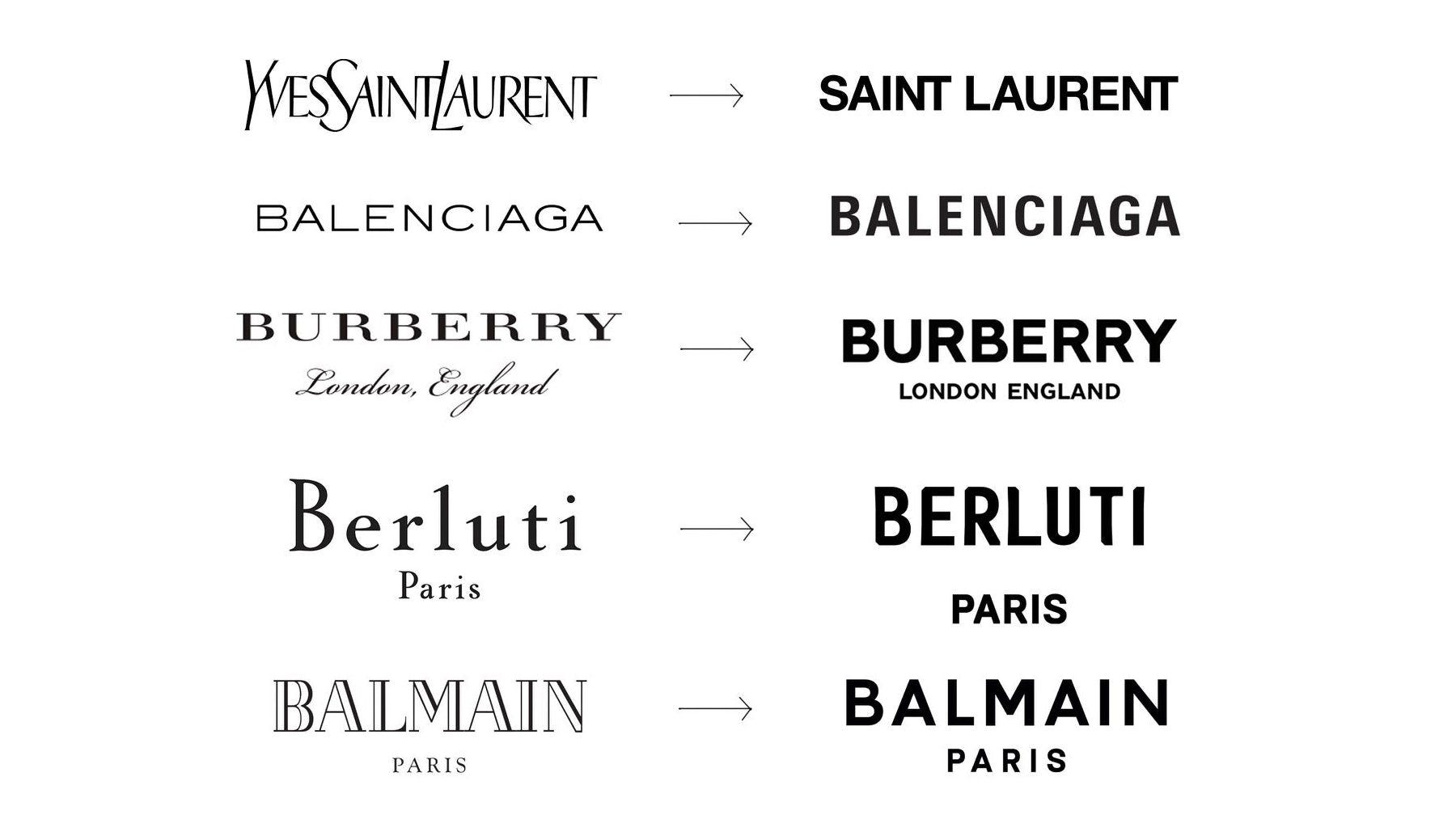
Back in 2018, Burberry was the pioneer of the simplification trend when it came to logos. Under their previous Creative Director, Riccardo Tisci, they replaced the original wordmark with a clean, minimal san-serif typeface, sparking a wave of all-caps, sans-serif wordmarks for luxury brands.
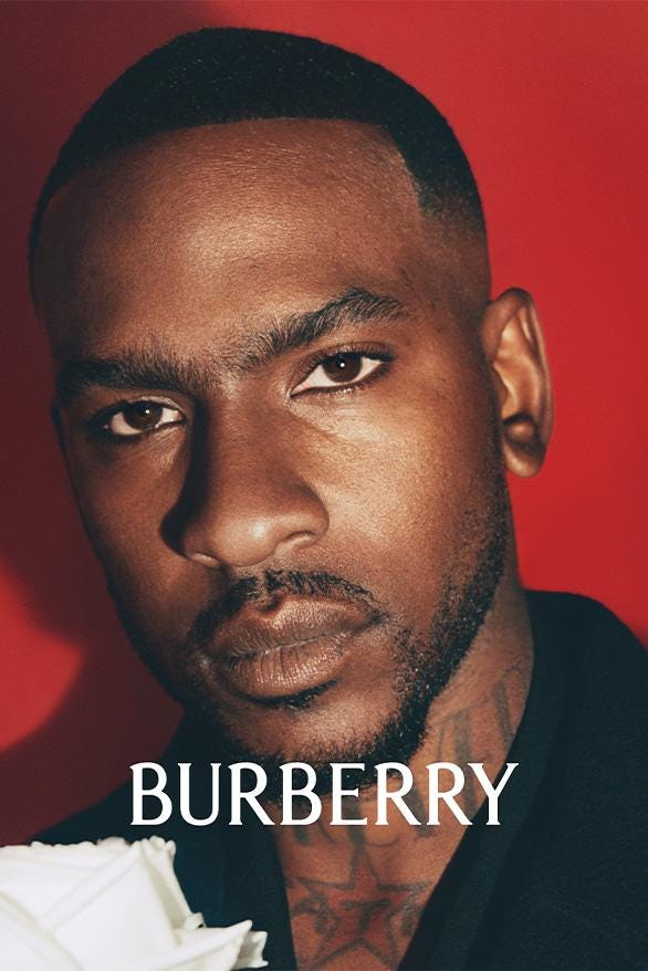
We probably all remember this moment
Enter new creative director Daniel Lee.
Daniel, a Brit from Bradford, has had a huge impact on the luxury world during his time at Bottega Veneta. He shifted the brand from a niche name in accessories to a highly sought-after, celebrity-worn hype brand. Since his arrival at Burberry, the brand has quickly reclaimed its Britishness, adding charm and character back into the mix.


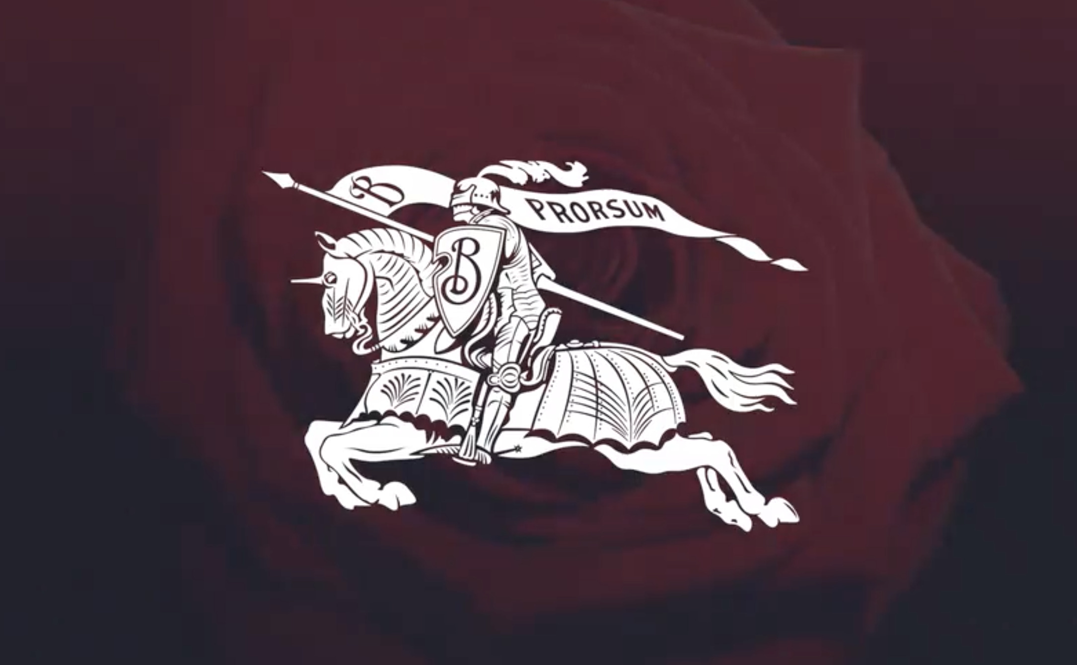
Inspired by some of Burberry's earlier logos, the former sans serif wordmark has been replaced with a tall, elegant semi serif typeface. The brand has also re-embraced the “equestrian knight” icon – a detailed illustration of a knight on horseback bearing a banner with the old motto “prorsum” (Latin for forwards). The knight has been drawn with a lot of nostalgia, adding warmth and charm to the very simple visual identity system. Interestingly, the original 122-year-old motif, titled Equestrian Knight Design, was the winning entry of a public competition to design a new logo for the heritage brand in 1901 (source).
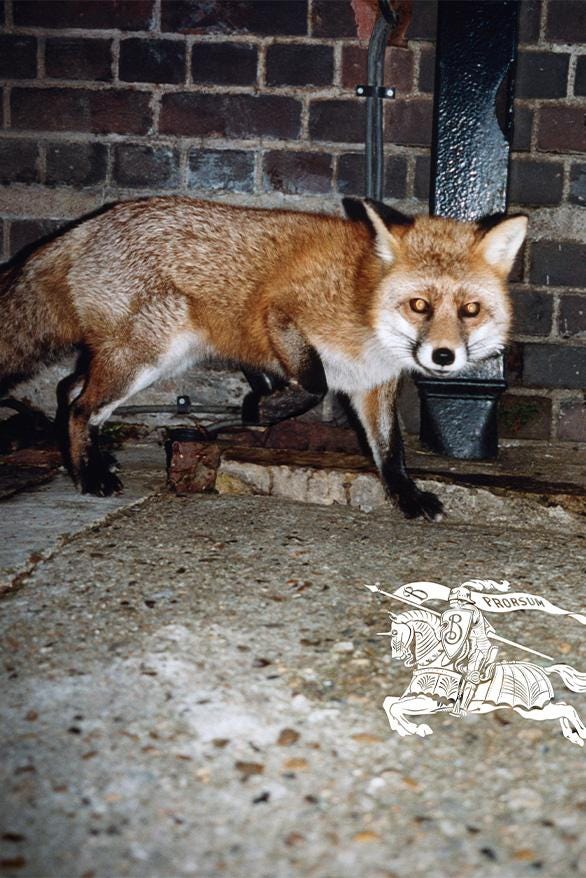
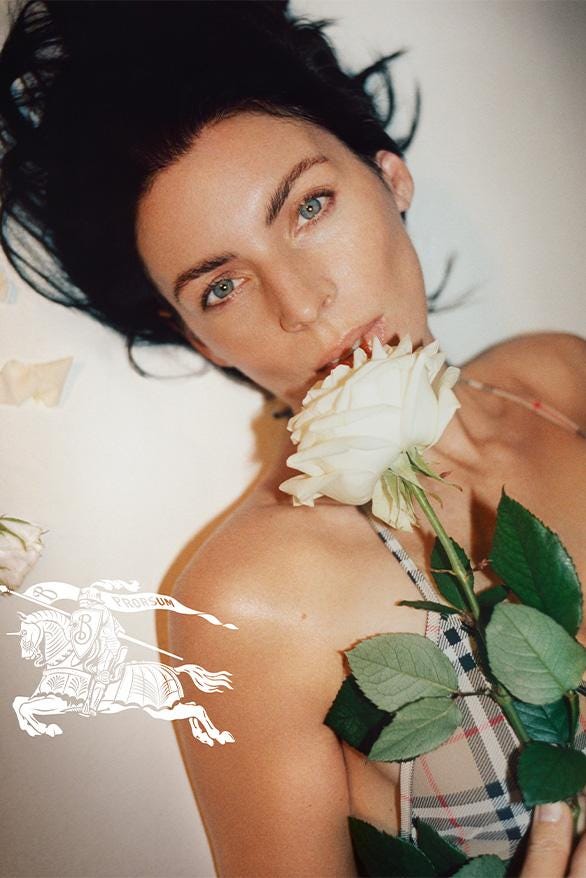
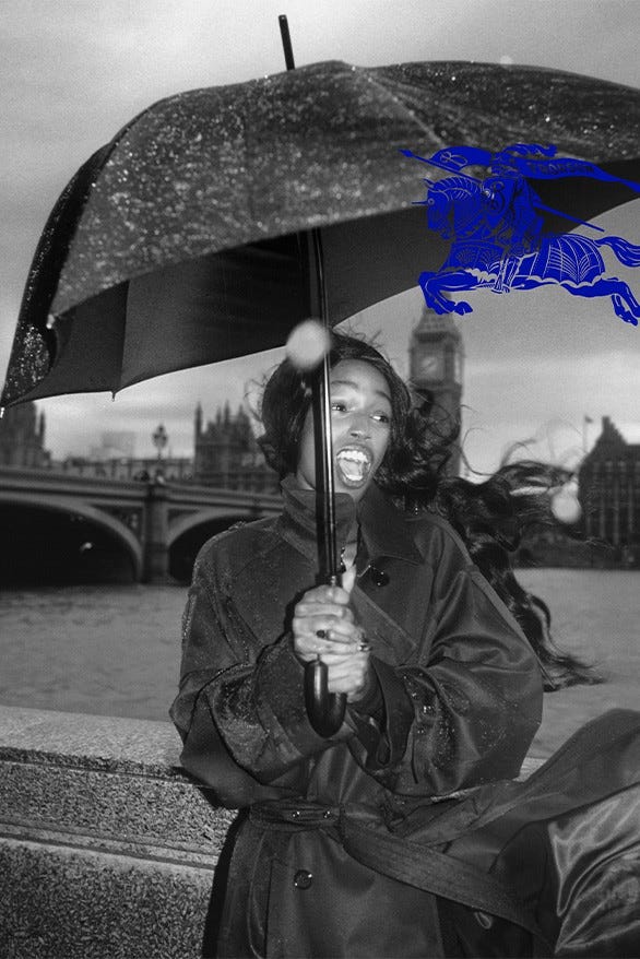
By adopting assets that retain character, the identity now reflects the heritage and charm of the brand. It's a nice shift, and throw in the new blue colour and it could be seen as quite a provocative brand in the face of the sameness the industry currently suffers from.
Could this be the catalyst for a new design trend?