

A vodka
Blink and you may have missed it, but Grey Goose underwent a subtle rebrand last year, adopting some new assets and a refined logo and typeface

Designed by studio Intertype, the rebrand is subtle in its approach but delivers on a system that creates proper worlds for the brand.
Out with the solo goose symbol, and in with a three-geese lock-up, inspired by the idea that geese don't fly solo. A nice nod to the sociability of the brand, celebrating togetherness and according to the brand, encouraging us to mark special occasions with the spirit.
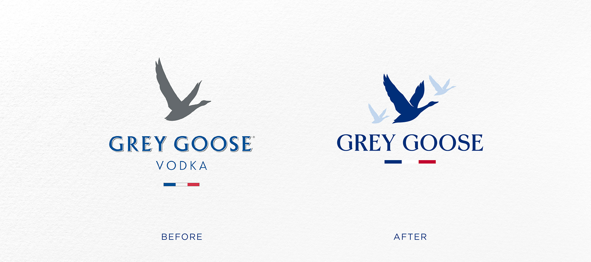
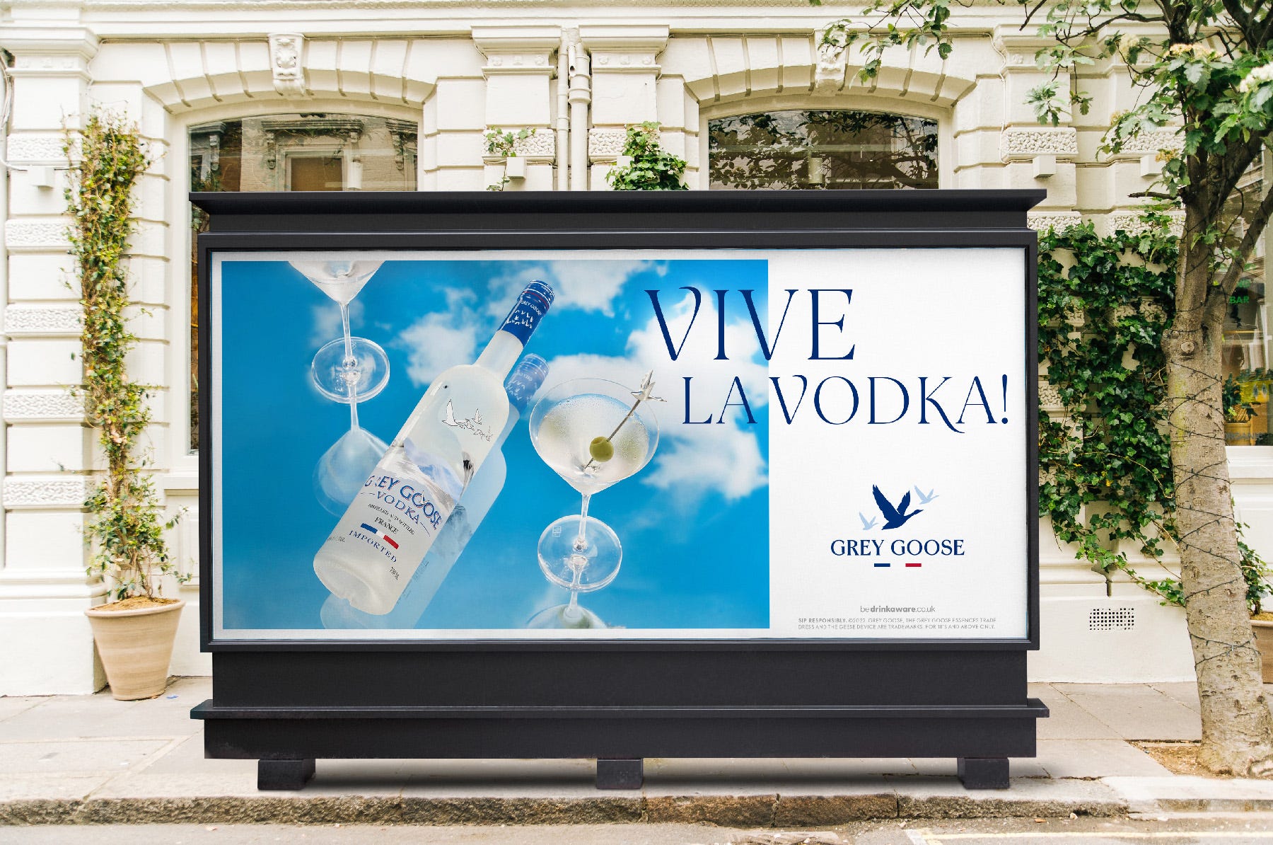
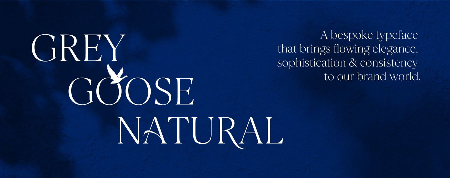
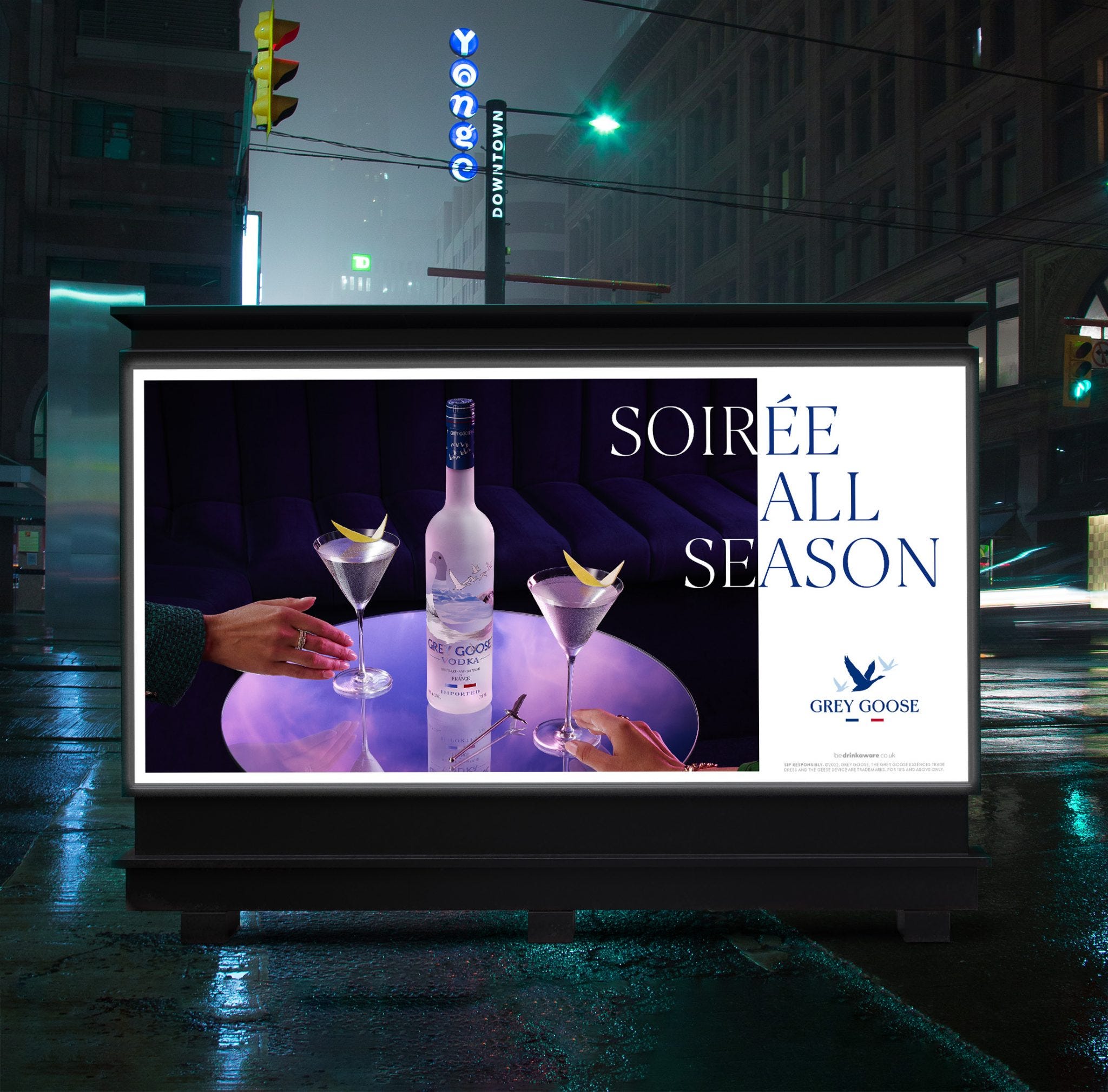
The palette was updated for more versatility, and the typeface is liquid-inspired and graceful. Intertype worked with lettering artist Ginger Monkey to create the logo, and the typeface was crafted in collaboration with Dalton Maag. 'Vive la Vodka' was written by ad agency MullenLowe


Intertype tapped Sidney Bensimon and Andy Grimshaw to photograph the Grey Goose rebrand across three creative shoots in New York and London, turning pencil sketches into mesmerizing, eye-catching images. These visuals, both day and night, highlighted the ice-cold purity of the brand's signature drinks, while creating a warm, inviting atmosphere that captivated viewers all around the world on billboards and digital ads.

The brand began as an artful exercise in branding illusions, but the rebranded identity is now distinctively wholesome and understated — while still embodying the brand's premium status.


It’s a successful rebrand that enables the brand to become more social, accessible whilst still retaining its premium status.