

Art Direction for beer…
Bit of a different approach this time – I won't focus on just One Thing. Instead, heres a broad bit of thinking on something thats caught my attention this week. PSA - it's a little long...

Solid Art Direction is an incredible asset for setting the tone and personality of a brand. Balance that with some excellent copywriting and you have a winning formula for getting into the hearts of consumers.
Visual expression is often the element that everyone tends to remember, the piece of the puzzle that drives an internal dialogue around what holding a brand says about you. It is a shortcut to the emotional connection needed between brands and consumers. Tugging at human needs, building desire, and most importantly, guiding purchasing decisions.
Excuse the cliché, but Apple is a solid example of this. Their excellence in product design is mimicked in their communications. Their choices in art direction are intentionally minimal, with imagery designed to do a lot with very little - a reflection of the simplicity and elegance of the product. This message of design excellence aims to either drive desire for a beautiful object or shape a consumer’s perception of themselves.

To paraphrase Scott Galloway, having an iPhone is a signal to others of taste, knowledge and wealth – a symbol of the owner’s status and (again paraphrasing the “Dawg”) appropriateness as a potential “mate”. This in turn has enabled Apple to build price premiums that have made them an almost $3T company.
Luxury fashion has always played in this space. Fashion ads often have eschewed language for visuals. Image-lead campaigns use the tactics of presenting the product in a style that reflects the brand’s vision whilst simultaneously challenging the viewer to “get it”. If you don’t “get it” then you’re potentially considered not worthy of the brand - a tactic designed to give FOMO to some and membership of a fictional “in-group” for the few that get it (or can afford it…).
To differentiate, brands often need to add a concept into their Art Direction, an idea or trick that helps land the message in a unique way to stop people in their tracks, build up recognition or communicate a product benefit. Think Absolut and their iconic ad campaign of the 80s & 90s. A really simple idea that helped cement the bottle shape in consumers’ minds as well as align their brand with different moments in culture, moments in time and other brands or artists they wanted shoppers to consider as their peers.

Art Direction for Beer has definitely had some highs and lows in the past. Success has come when brands have played across categories - read stealing cues from others. Heineken’s clever push into premium was fostered by partnering with the James Bond franchises, being the chief alcohol partner on the films, cementing it in consumers’ minds as a more refined choice at the bar.
Stella Artois, another brand that has seen success in borrowing from other categories, has historically used the visual languages of French & Belgian cinema and art deco era luxury travel posters, painting the brand as the epitome of the refined, relaxed European café life.
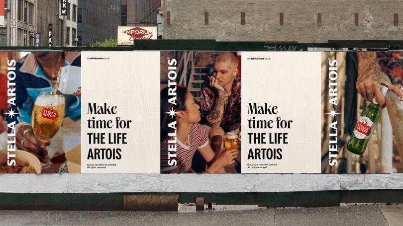
Recently, JKR out of the USA has refreshed the Art Direction for Stella Artois in North America, as well as introducing a refined design system and tweaked assets to help build more relevance to younger consumers.
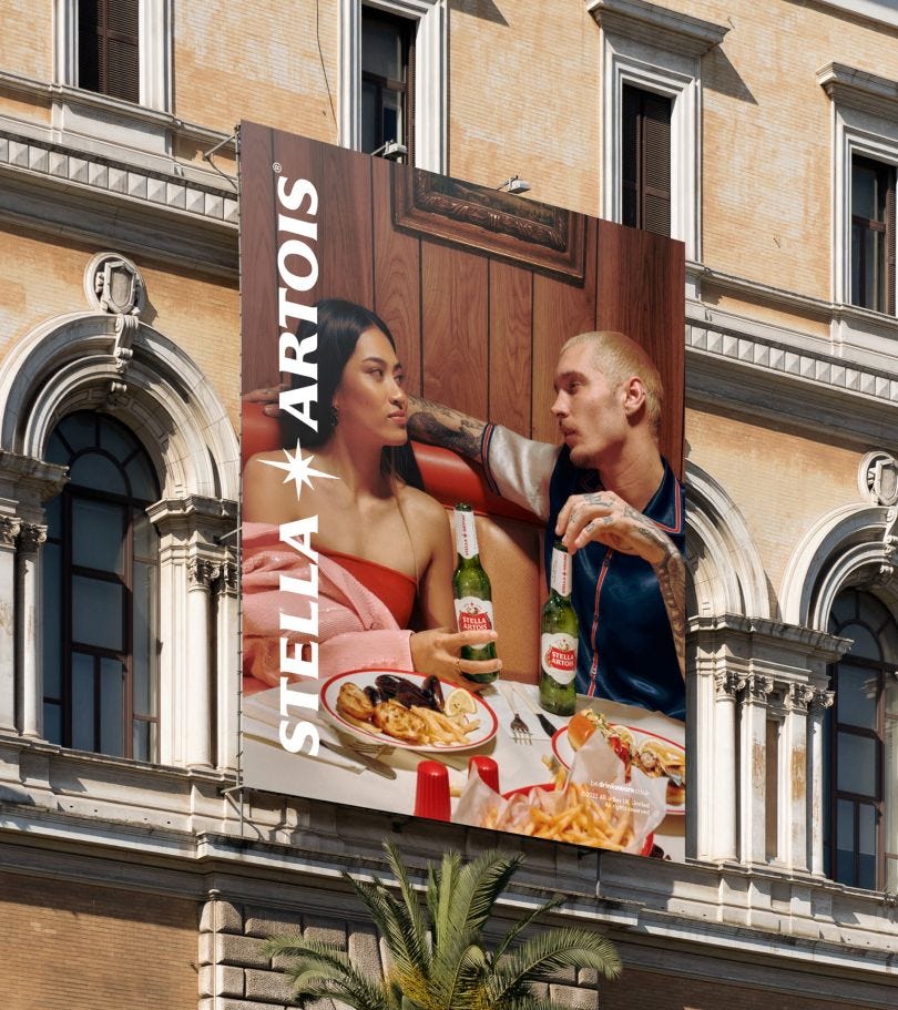

Repositioning the Stella Artois occasion away from the refined tables of fine dining and the luxurious vistas of Cote d’Azur France, the focus is on a more everyday world the team dubbed the “modern table”.
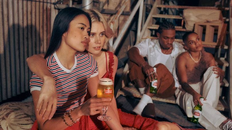
It’s a great balance of high and low. The featured talent are styled immaculately in an elevated but accessible fashion and then paired with settings of diner tables, rooftop picnics and house parties.
In the minds of a viewer, it serves a couple of functions. The scenes are definitely in the scenarios of a date or party with couples and friends enjoying each other’s company. But what it attempts to unlock is permission for people entering those scenarios themselves to enjoy a Stella as an acceptable choice for occasions that may traditionally have been a cocktail or wine moment.

It’s also meeting audiences where they are - younger consumers aren't necessarily heading to high luxury locations that often, but are definitely going out and treating themselves. The balance is right though, it may be a table of lobster rolls but it’s still an occasion to dress up and be fabulous.
Sometimes the liquid is the focus of beer art direction. Guinness has forever played with their iconic black-and-white pint to drive recognition. The #LookslikeGuinness campaign over the covid lockdowns focussed on this uniqueness, encouraging followers on their social channels to share images that look like the iconic pint.

Other beers tend to lean into their pack to drive recognition – Heineken’s green bottles – or swirling amber liquids to drive thirst in their consumers.
Chuck Studios in Europe have been working with Molson Coor’s European group to develop what they've called a “culinary identity” for Miller Genuine Draft.
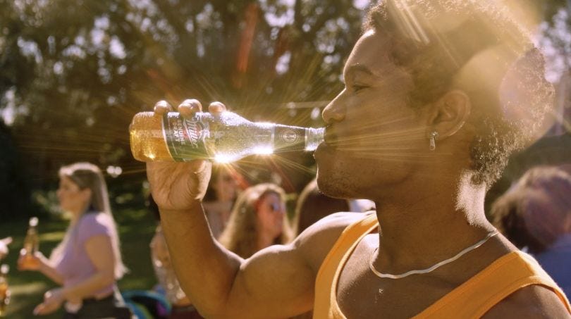
Miller Genuine Draft’s brand positioning aims to play in music and nightlife, aligning with events and activities with music producers, and promoters as well as running their own 3-day festival in 2019.
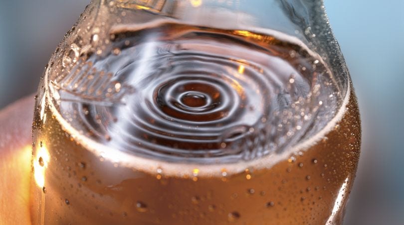
With this in mind, Chuck Studios developed a suite of assets for Miller that builds on this positioning. By using music and sound to influence the liquid the team have created visuals that are ownable and distinctive. Taking a practical effects route - i.e. doing it in real life, not CGI - the team used a range of tools to make sound vibrate through the beer. Here’s a link to their behind-the-scenes film. Assets in use can be seen here.
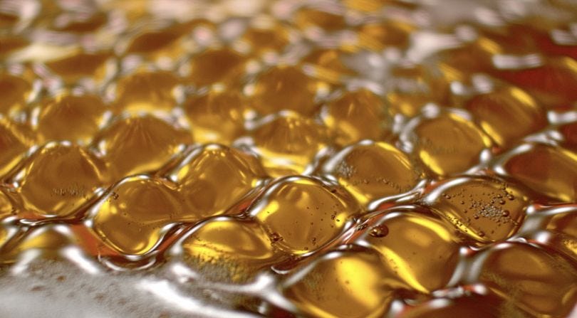
The effect is quite fun, patterns ripple through the liquid in time to the music, splashes of bubbles and liquid dance out of the foam and pack shots bounce along to the soundtrack. It’s a beautiful and ownable idea for a beer brand and really helps connect the viewer to the brand’s aim of being the beer for nights out.
3 other things
D&AD happened recently here's something I liked from the awards show
A one-man shoe factory! A fun live-mould polyurethane foam shoe moulded to the wearers foot
Agency Mullen Lowe has had a refresh of their brand, created in-house - it’s quite nice