


In the world of branding, logo updates always get a lot of attention (remember that Burberry one I wrote about?)
Rightly or wrongly they can stir up a lot of debate, as audiences grapple with changes to something beloved – especially if the change could be labelled as a bit undercooked.
In my career, I’ve had a few of these very public moments. It can be incredibly satisfying to have people talk up your work, even if the focus is only one component of a wholistic brand refresh.
I’ve also been on the reverse end when a logo refresh goes bad, wading through the mental toll a public bashing can take on you. This sounds a little bit dramatic but I am definitely a believer in what Strategist and podcaster Scott Galloway states - “nothing is as good or as bad as it seems”.
Debate is great and builds attention to those that do well and creates learning for an industry when things kind of don’t - just maybe be a little nicer to those designers and marketers who may be copping a bit of public backlash!
So with that in mind let's wade into 2 logos that have popped up over the last week or so.

[Image source]
![[Image source]](https://i0.wp.com/hyperallergic-newspack.s3.amazonaws.com/uploads/2023/03/Statent-Island-Selfie-Wall-1200x723.jpg?resize=780%2C470&quality=100&ssl=1)
WE❤️NYC
New Yorkers are famous for the passion they have for their town. It’s a storied city that the world is very familiar with. We all kind of understand when people mention Wall St, Midtown, Brooklyn and even Staten Island from our exposure to media and entertainment.
So you can understand why leaders might want to lean into what New Yorkers and outsiders know from the city’s graphical worlds to help promote the town and pull a community together.
The original I ❤️ NY was created in 1976 by Milton Glaser, famously doodled in the back of a yellow cab on a scrap of paper, during a time when New York was emerging from years of bankruptcy, high crime rates and rampant poverty. Ironically it was devised for a tourism campaign but has become a beloved piece of the city – even part of the Museum of Modern Art’s permanent collection. It is a simple, thoughtful graphic, designed to pull at hearts and draw on New Yorkers’ pride for where they call home.

The original logo created by Milton Glaser in 1979
Fast forward to 2023 and the city and state governments of New York want to pull the pride string again to remind people of the love they have for their town - especially after years of turmoil through the pandemic, protests and a few years with a President who may not have had everyone’s best interests at heart.
So hence a refreshed mark. Helvetica replaces the ITC American Typewriter typeface to reference the famous New York Subway’s type and map system, the graphic heart is now a rendered “Apple-esque “ emoji heart and NY has been pushed out to NYC to encapsulate the city’s full name.

[Image source]
![[Image source]](https://cdn.i.haymarketmedia.asia/?n=campaign-asia%2Fcontent%2FWe+love+NYC.jpg&h=570&w=855&q=100&v=20170226&c=1)
Design-wise there’s not much to hate really. The choices have rationales that make sense to regular people, not just marketers and stakeholders. The type is inoffensive, familiar and synonymous with the city. And surely going from I to We is a nice thing, right?
Where this falls apart is the very obvious “wearing your strategy and internal objectives on your sleeve” problem. The choices made on the change were very much geared towards solving the problem given to the creative agency, overtly, and obviously.
Obvious sometimes doesn’t really gel well with audiences. That may seem a strange thing to say in design, but for a “place brand”, and that’s what this is, being obvious can feel like forcing one idea of a place on your audience. People like some ambiguity when it comes to geography, especially geography like a city with all its history and culture. How we see a city or a country is very different to how our friends or peers see it - and it’s very personal. By shifting from “I” to “we” it almost claims all the very unique, personal perspectives and lumps them into a homogenous view of what New York is. It also doesn’t help when you make these kinds of changes to a symbol that’s as famous as the skyline it comes from.
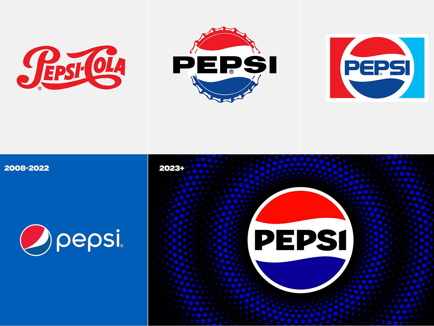
Pepsi
Pepsi has always been the challenger in the soft drink game with their bright red competitor stealing a lot of minds and wallets. But with that comes the freedom to experiment, to push their brand around as well as the brands of their portfolio products.
[image source]
Whilst new flavours and delivery techniques for Pepsi have rumbled across the drinks landscape on a regular schedule, the Pepsi brand, however, has stayed the course for the last 15 years with the warped beach ball. However, they knew that audiences still collectively remembered the logo as being a 3-coloured circle with the name in the middle – thus they've gone backwards to move forward.

The new logo comes at the head of a full refresh for the product brand. But as mentioned at the start of this newsletter it is the logos that get all the press!
By readopting the older style of mark the team has freed the logo a little, allowed for bolder application and is not hindered on where to put the wordmark. It's pretty confident and in application on cans is bold and in your face – which is great for product branding.

Personally, I’m not a huge fan of some choices. The typeface has some needed quirk but could be a tiny bit braver. The blue the brand has chosen to lead with is a bit on the purple side - the older blue is bit fresher. That said the revised red is brighter, the shapes nostalgic and the integrated logo much more versatile for the brand.

Thanks to Anubha Sahasrabuddhe for the heads-up on this one.
The pack range is very simplified - logo first - and will need to rely on the colour and flavour name to drive choice but they've definitely learnt from their key competitor's success on reinforcing those key assets.
Is it a great refresh… it's not the best but it is definitely a million miles away from the ludicrousness of the 2008 refresh and those crazy rationale documents! Hopefully, this leads to positive metrics for the much-loved brand.
You can read a little more about the old logos creation and utterly mental rationale here
3 other things
A German brewery is a step closer to powdered beer
A conceptual look at what products in a water-scarce future might look like
The decanters for this Hennessy and Kim Jones "collab" are beautiful